Visual identity and pre-launch strategy for Stay Little Co.
A personal venture born from a desire for kids’ clothing that mirrors our own lifestyle. I developed a nostalgic, sun-bleached visual identity, backed by a community-focused pre-launch landing page.
Client
Stay Little Co. (Self-Initiated)
Role
Creator and designer
The vision
Stay Little Co. started with a simple idea to make the clothes we wanted to see our own kids in. Inspired by relaxed Aussie surf culture and the hazy, sun-bleached memories of our own childhoods, my wife and I set out to build a brand that felt like a chill retreat from the “busy-ness” of modern parenting.
Nostalgic comfort, everyday play
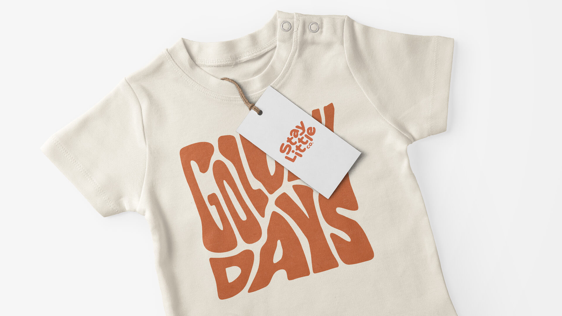
The creative direction was driven by a nostalgic-cool aesthetic. I wanted the brand to feel like a well-worn favourite t-shirt from day one.
Branding and visual language
I designed a logo and palette that feels relaxed and organic, leaning into sun-drenched tones and vintage-inspired typography.
Beyond just kids’ clothes, we designed the brand for the parents, too. We developed a series of ideas for coordinated apparel that allows for a shared family aesthetic without the cheesiness often found in matching outfits.
Community and digital strategy
A brand like this lives or dies on its community. I built a bespoke landing page designed to capture that chilled out feeling while serving as a high-conversion waitlist for our launch.
The status
While the project is currently in a pre-launch phase as we navigate new professional chapters, the entire infrastructure is ready for play. From the custom illustrations and garment designs to the technical launchpad, Stay Little Co. is a fully realised brand identity waiting for the right swell to catch.